My role
UX Lead -- Interaction Design, Visual Design, User Flows, Hifi Prototyping and user research
Team
Product designer
Product manager
Flutter engineer
Flutter engineer
Quality assurance engineer
Timeline
8 weeks
Overview
We're doing this to address significant usability issues that we've identified through user interviews and focus groups.
Our data shows that while many users interact with the filters on the booking page, only a small fraction actually apply them, indicating a potential problem with the filter functionality.
Additionally, the conversion rate from the booking page to an actual reservation is low, with only about a quarter of users completing the booking process.
By improving the filter usage and streamlining the booking flow, we aim to make it easier for users to find what they're looking for and complete their reservations, ultimately enhancing their overall experience and increasing our booking rates.
CONTEXT
The message was clear
We conducted user interviews and held a focus group to get a baseline for the behaviour of the users. From these sessions we created tags that could help us define pain points so, after diving into the data, we found something interesting. Lots of users are clicking our filters on the booking page, but only a tiny fraction actually use them. And, out of everyone who checks out the booking page, only about a quarter end up making a reservation. This also lead to us creating two success metrics
Primary
Improving filter usage - looking at funnel analysis, we see that users that view the booking page click filters 48% of the time but only 7.7% of those clicking filters actually apply them.
Secondary
Conversion rate from booking page to booking - Of all users that get to the booking page only 28.6% are converting to a booking. By improving the flow to get to booking page and narrow down options quickly we assume this will have a positive impact on the overall conversion rate.
The Problem
Couple of points
After we dove into the data we identified some pain points we were going to tackle on in the first version. The data gave us some good insights and made sure we were focussing on delivering the users actually asked about.
The wrong filter categories. Some examples: Asian delight and Night disco fusion ???
No price range or the ability to sort. This is some basic filter functionality you expect
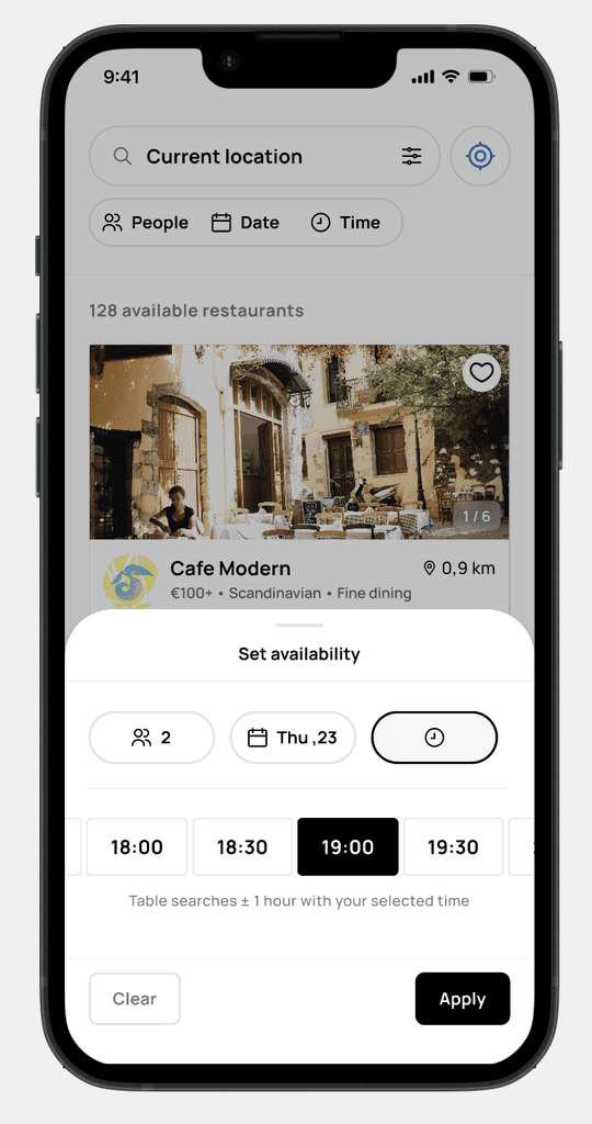
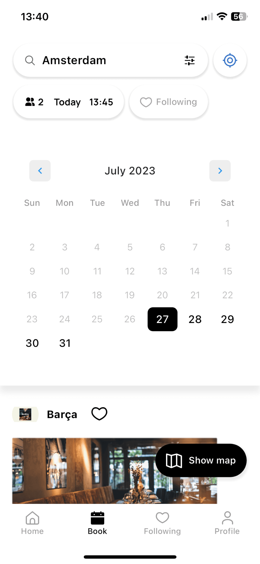
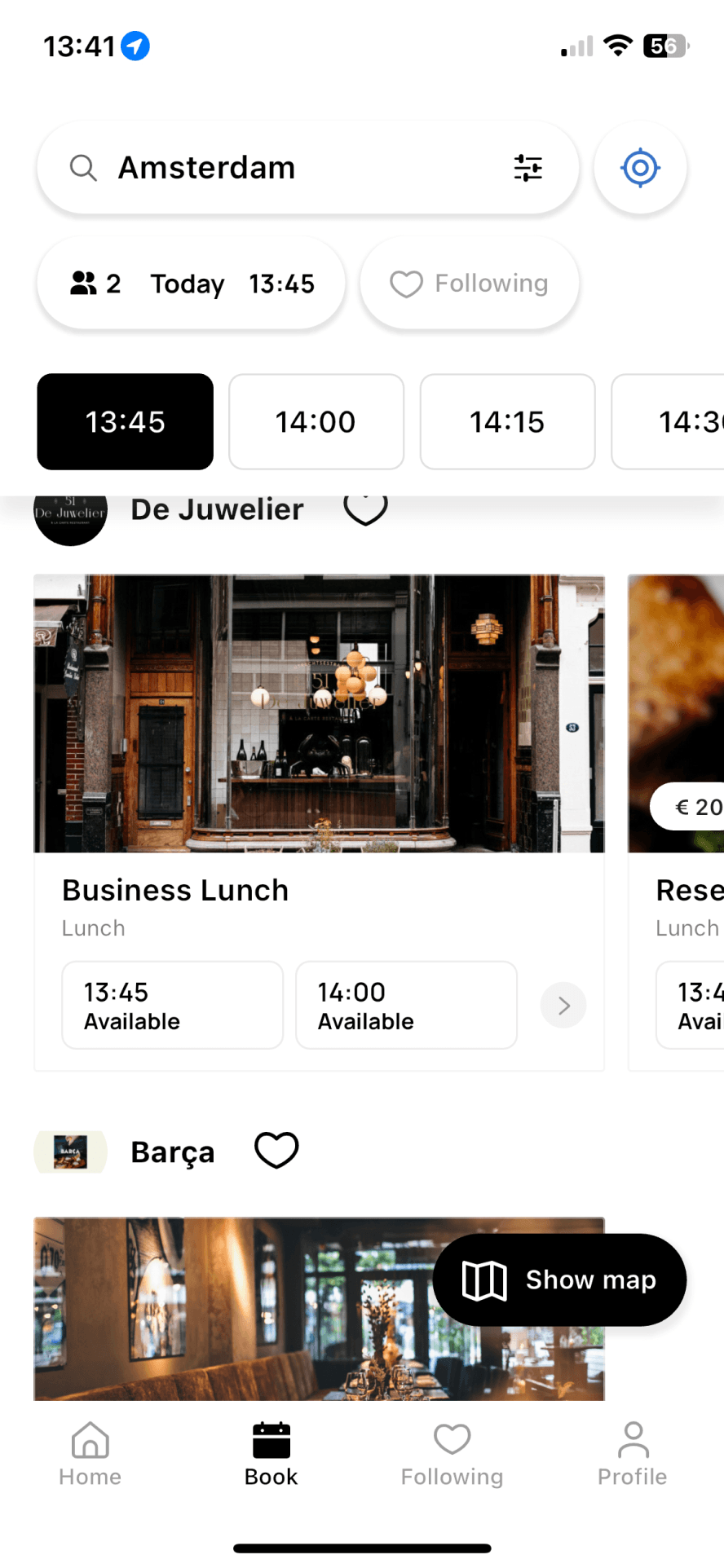
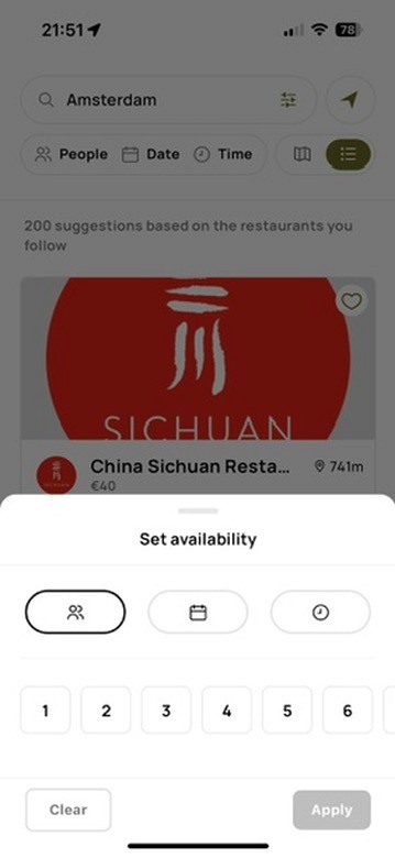
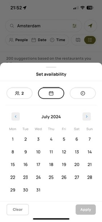
Non intuitive way of setting your availability. This lead to inaccurate results
filter categories
You got to start somewhere
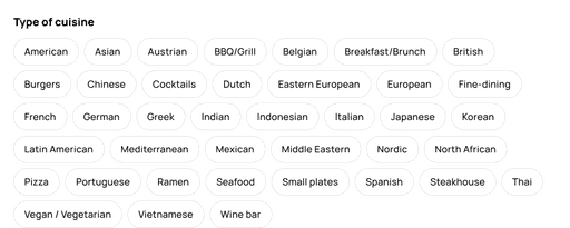
We knew a couple of user pain points. But I also conducted a workshop with the marketing team and the developers to identify the most useful cuisines we could add.
This is the first version we came up with. This includes the most used cuisine tags and our previous most used tags.
Lets sum up the old issues again...
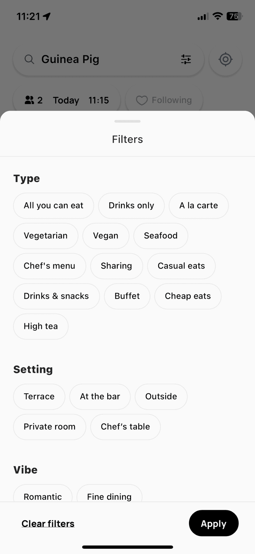
Weird categories. Preventing restaurants from adding weird ones without supervision or guidelines. It enhances user experience by providing consistent and reliable category options, making it easier to navigate and find relevant information.
Not being able to sort. Reducing the frustration of sifting through endless information. It enhances user experience by making it easier to find relevant content quickly and effortlessly.
No price range. Ensuring they only see options that fit their budget. It enhances user experience by making the search process more efficient and tailored to individual preferences.
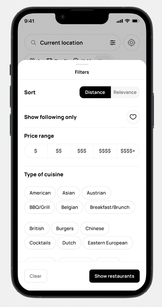
Now for the new filter.....

+ Being able to sort into distance or relevance
+ Added the price range so we give the user more customisability of filtering the results.
+ Added the new cuisines tags so the user can filter on cuisine
Kept the slide in It enhances user experience by preserving a seamless interface that encourages purposeful interactions without compromising visual appeal.
Redefining availability
Pulling it through
Also we greatly improved the speed of the app with this so big up to the devs
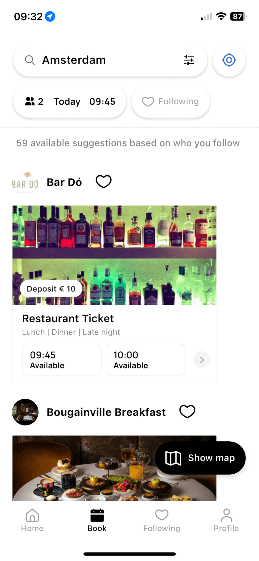
Let’s get the old design in here
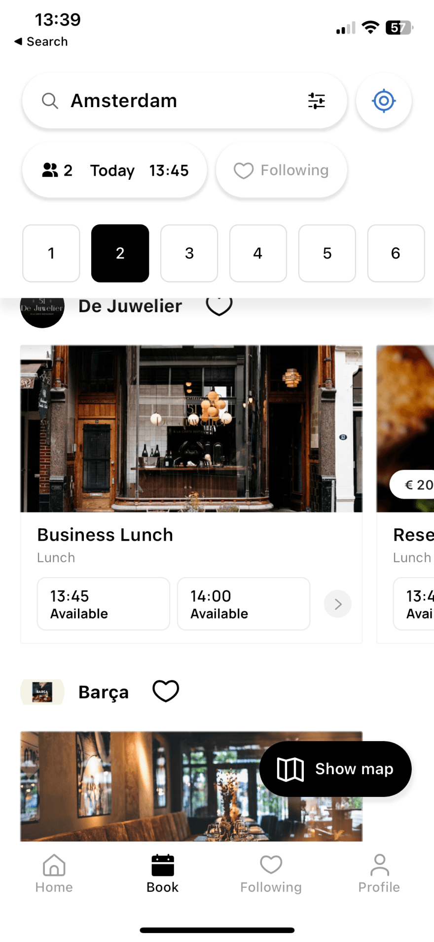
And the new design in here
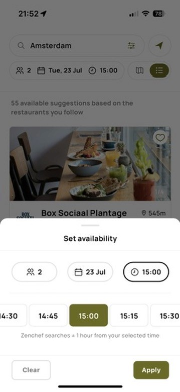
Interactions
Nice details
We added smooth transitions between options and included haptic feedback to make the experience feel smooth and satisfying. This improves UX by making interactions more responsive and enjoyable, enhancing overall user satisfaction with the interface.
Big wins
Small tweaks big wins
Some small tweaks that add a lot to the the featured that we added and compliment each other beautifully
Restaurant detail card
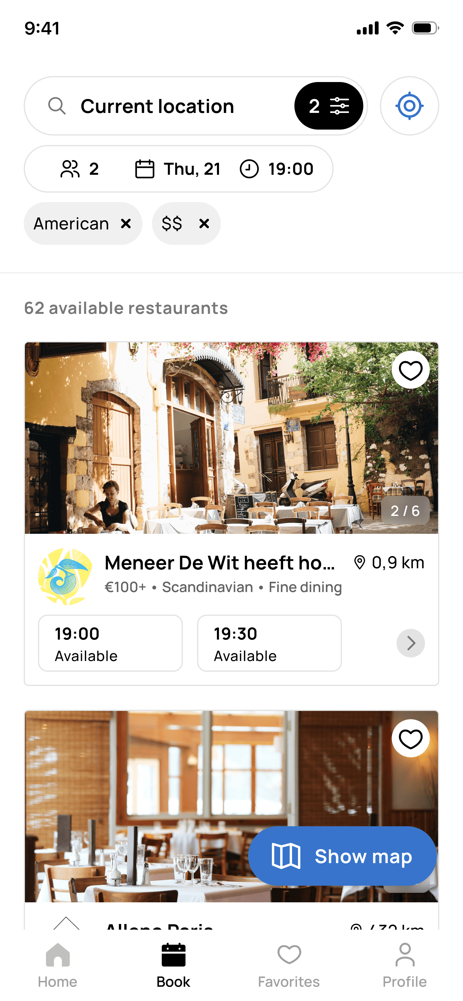
+ Seeing chosen filters We added the used filters right on the restaurant card so you can see what's influencing your search results. This makes it easier to understand why certain options are showing up, helping you navigate and decide more clearly.
+ More restaurant We put a carousel on the restaurant card to give users a better first look. This way, they can quickly get a sense of what the place is like right from the start.
Also being able to search cuisine
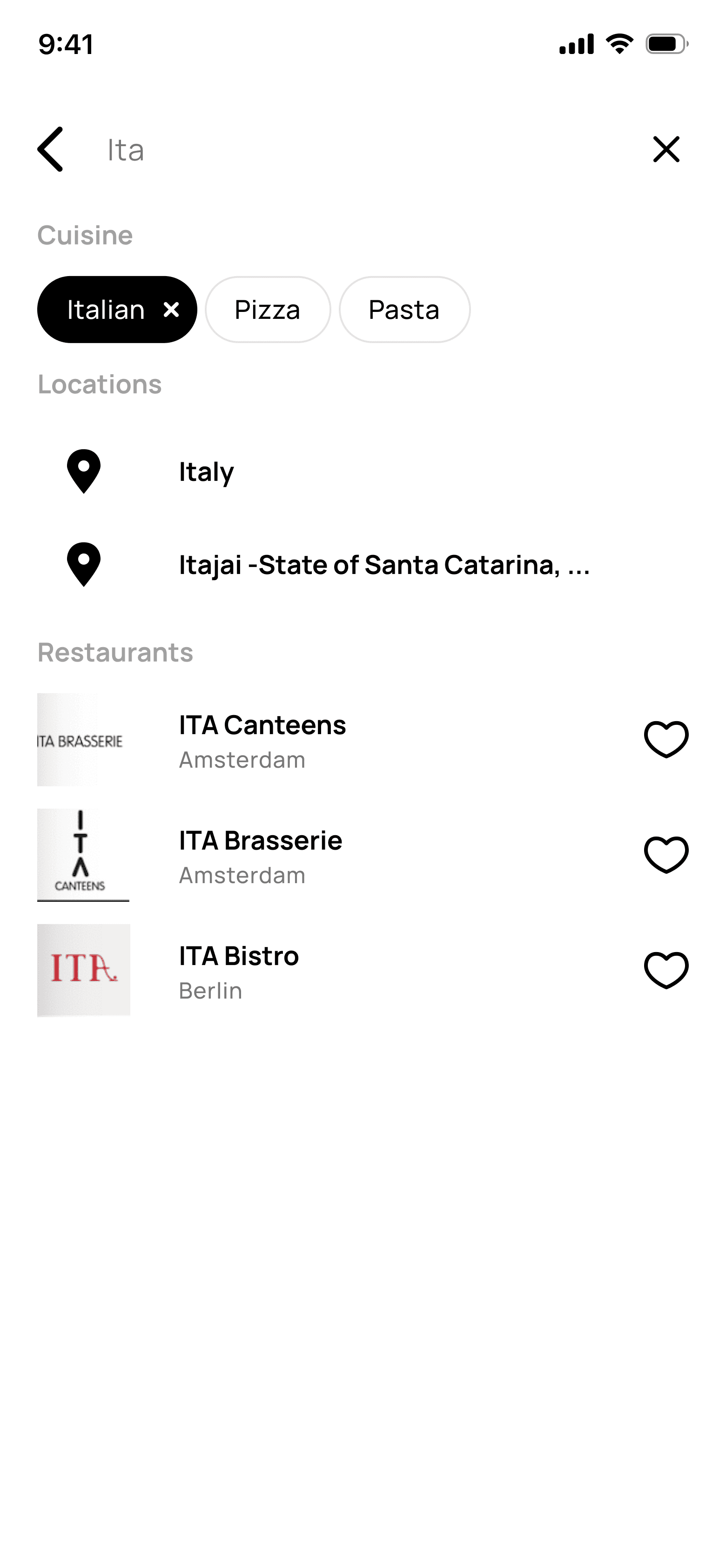
+ Search cuisine We've added the option to search by cuisine as well, which is a nice addition for users looking to find specific types of food more easily.
Retrospective
Outcome & learnings
Overall, I'm quite happy with our results. It would be even better if we could conduct more user interviews throughout the process to validate the changes we've made. Getting regular feedback from users helps ensure that we're on the right track and that our improvements are genuinely meeting their needs. This iterative approach not only enhances our understanding of user preferences but also fosters a user-centric design process, ultimately leading to more effective and satisfying outcomes for everyone involved.
Primary
With the latest updates to the booking page, we've seen a increase in filters applied. this rose from 7.7% to 28%. This indicates we made a good first improvement to the filters.
Secondary
The bookings increased from 28.6% to a whopping 45% that gives a great result from the availability working nicely with the filters and the other small tweaks we did
Next project
